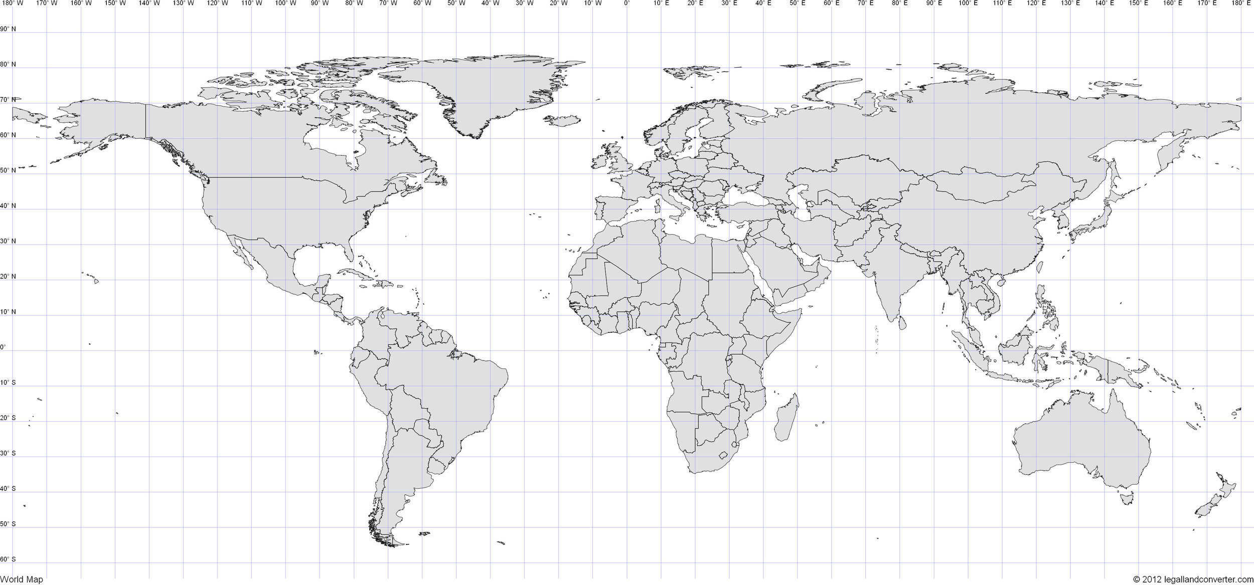
The first map, above, is an equal-sized grid of the world, where 10 degrees lat/long is signified by a square (not a rectangle): http://www.legallandconverter.com/images/world.jpg . This is essentially a world map without a projection.
The Mercator Projection is the traditional projection used to turn the globe into a flat surface. It originates as a sea chart, i.e. a very practical use. More info: https://en.wikipedia.org/wiki/Mercator_projection and you can see the difference in country size below.

Mercator projection. Source: https://en.wikipedia.org/wiki/Mercator_projection
The Winkel Tripel Projection is seen by geographers as the best (fairest, most representative) projection. The National Geographic Society switched to this a few decades back. Shown below. More info: https://en.wikipedia.org/wiki/Winkel_tripel_projection
.svg)
Winkel Tripel Projection. Source: https://commons.wikimedia.org/wiki/File:1937_world_map_(Winkel_tripel_projection).svg
Robinson Projection also seen as good, but Winkel is generally preferred. This is what National Geographic used the Robinson for a long while, before switching to the Winkel Tripel. Info on Robinson here: https://en.wikipedia.org/wiki/Robinson_projection - image of Robinson projection is below, from http://alabamamaps.ua.edu/contemporarymaps/world/world/world3.jpg
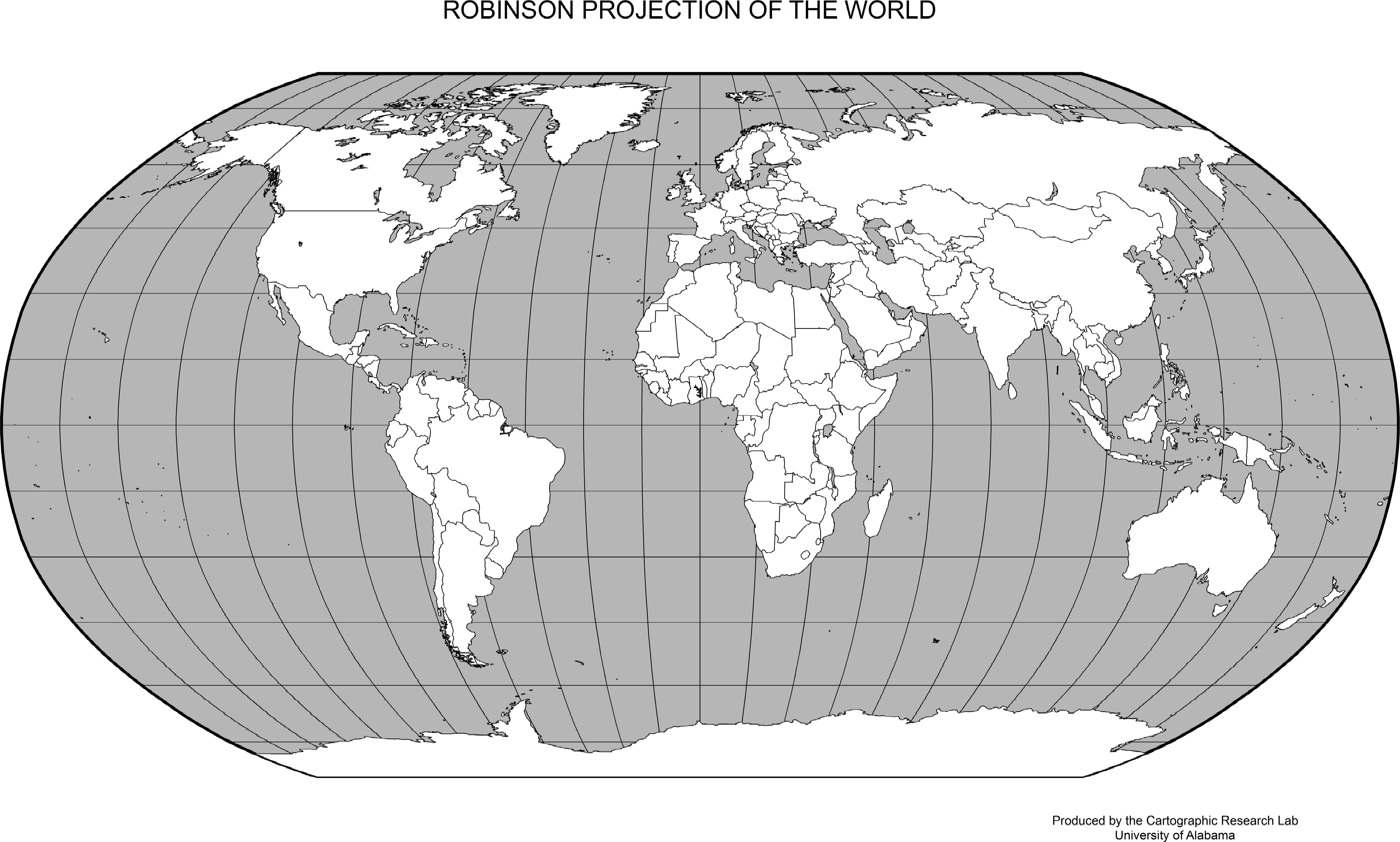
Robinson projection. Source: http://alabamamaps.ua.edu/contemporarymaps/world/world/world3.jpg
Here's a good article summarising the pros and cons of the Mercator vs Peters projections, and other preferred projections: https://www.thoughtco.com/peters-projection-and-the-mercator-map-4068412